

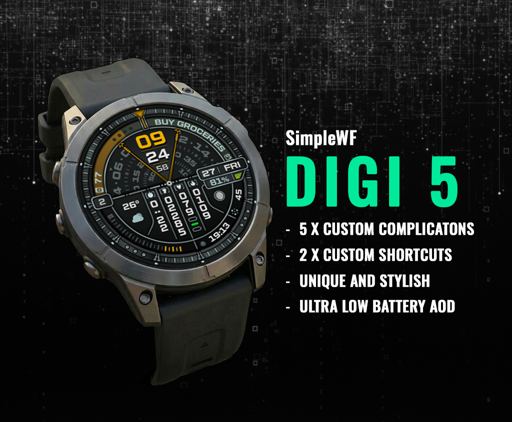
Smartwatch screens are small, but the amount of information we expect them to display keeps growing. Time, weather, heart rate, battery level, steps, calendar events, and app shortcuts all compete for the same limited space.
Many digital watch faces try to solve this by simply adding more complications. The result is often a cluttered layout that's difficult to read at a glance.
A different approach is the segmented dashboard design, where information is divided into clearly organised sections. Instead of cramming everything together, each piece of information has its own place, making the watch face feel cleaner, faster to read, and more practical for everyday use.
What Is a Segmented Dashboard Watch Face?
A segmented dashboard divides the watch face into dedicated zones.
Rather than placing complications randomly around the display, each section has a specific purpose.
For example:
- A large central area for the time
- Separate sections for health information
- A dedicated weather area
- Battery status in its own location
- Clearly positioned app shortcuts
This organisation helps your eyes quickly find the information you need without scanning the entire screen.
Why Layout Matters More Than the Number of Features
Adding more features doesn't automatically make a watch face more useful.
In fact, too much information can have the opposite effect.
A well-designed layout focuses on:
- Readability
- Logical spacing
- Consistent typography
- Visual balance
- Quick recognition
When information is grouped logically, you spend less time searching and more time simply glancing at your watch.
This is especially useful during meetings, workouts, commuting, or travelling, where you often have only a second or two to check the information.
The Advantages of a Segmented Dashboard
A segmented layout offers several practical benefits over a traditional information-heavy design.
- Faster Reading
- Your eyes naturally learn where each type of information is located, reducing the time needed to find it.
- Better Organisation
- Health data, weather, battery level and shortcuts each have their own dedicated space instead of competing for attention.
- Cleaner Appearance
- Separating information into sections creates a more balanced design without making the watch face feel empty.
- Easier Customisation
Many segmented dashboards support multiple complications, allowing users to personalise the information shown while keeping the layout organised.
Designed for Everyday Use
A segmented dashboard isn't only useful for outdoor adventures.
It also works well for:
- Daily commuting
- Office work
- Fitness tracking
- Business travel
- Weekend activities
Because information is grouped logically, you can quickly check the details that matter most without opening multiple apps.
How We Applied This Design to DIGI 5
When designing DIGI 5, our goal wasn't to add as many complications as possible.
Instead, we focused on creating a dashboard that remained readable throughout the day while still offering plenty of useful information.
DIGI 5 uses a segmented layout to separate time, health metrics, weather, battery information, and shortcuts into clearly defined areas. The result is a watch face that feels information-rich without becoming overwhelming.
The layout also supports custom complications, allowing you to tailor the dashboard to your own daily routine while maintaining a clean and consistent appearance.
Pair It with Useful Wear OS Complications
A segmented dashboard becomes even more useful when paired with the right complication apps.
Depending on your needs, you can display information such as:
- Compass direction
- Health metrics
- Weather
- Calendar events
- Battery level
- RSS feeds
- Navigation tools
Choosing the right combination allows your smartwatch to become a personalised dashboard instead of simply displaying the time.
Final Thoughts
A great smartwatch experience isn't about showing the most information. It's about showing the right information in a way that's easy to understand.
Segmented dashboard watch faces help organise information into logical sections, making them easier to read during busy everyday life.
If you prefer a clean digital dashboard that combines readability with extensive customisation, a segmented layout is well worth considering.
One example is DIGI 5, which applies these design principles to create a practical dashboard for Wear OS users who want information at a glance without unnecessary clutter.